Creating Universal Widgets - Transforming React components into cross-framework widget
Widget is like a mini-application or component that can be easily plugged into any website. It's a small, self-contained functionality.
We'll build a React-based widget and bundle it with rollup to create a standalone module in a way that can be used inside a Vue project.
Advantages of building a widget
- Rather than reinventing the wheel for each framework, a widget simplifies integration in different environments. This is useful when you want to provide a framework-agnostic solution to clients.
- You have a legacy component which may be challenging to integrate into the newer tech stack you want to migrate. Converting it into a widget can be a good option.
- You have several projects that need the same component, and the team can choose any framework and still use it.
Features of our widget
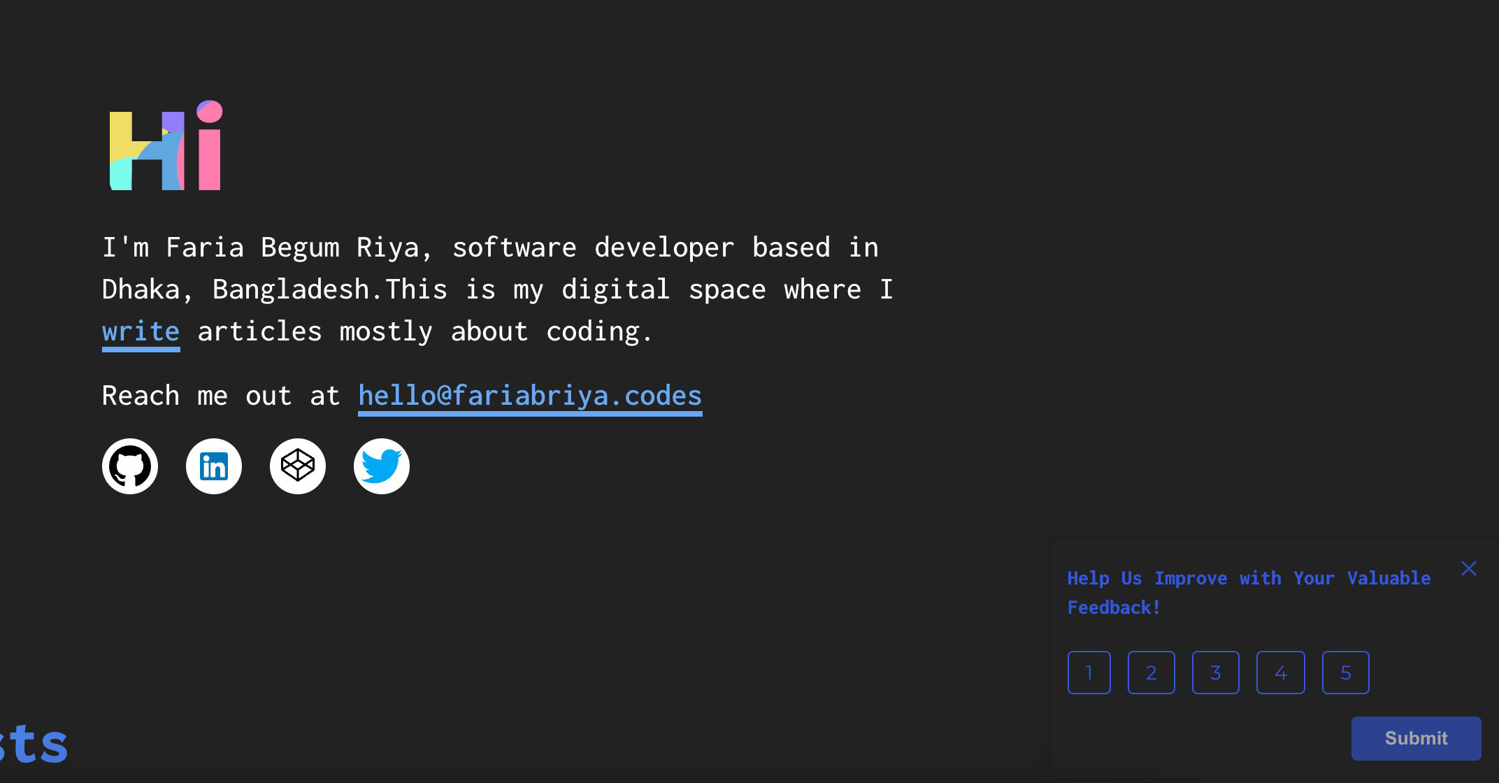
We will build an application that asks for users' feedback. It should pop up on the right bottom corner of a webpage.
This is a simple example of a widget that we will build
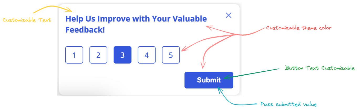
The widget should have the following features-
- Text should be customizable.
- Should be able to pass a color code that will change the color theme of the widget.
- Button text can be changed.
- Should be able to get the rating value through a function.
In any external application, we should be able to initialize the widget with a init function with preferred settings like this-
feedbackWidget.init({
  title: "Rate your experiecnce with the website",
  theme: "#de334",
  buttonText: "Rate Us",
  handleSubmit: (val) => doSomethingWithValue(val)
})
Creating the component in React
First we will code the FeedbackWidget component in React.
/* src/components/FeedbackWidget.js */

import { useState, useEffect } from 'react';
import Rating from './Rating';

const FeedbackWidget = (props) => {
  // set default prop value
  const {
    title = 'Help Us Improve with Your Valuable Feedback!',
    buttonText = 'Submit',
    theme = '#3457dc',
    handleSubmit = () => {},
  } = props;

  const [rating, setRating] = useState(null);

  // emit method on submit button
  const submitRating = () => {
    handleSubmit(rating)
  }

  return (
    <div className="brand__feedbackWidget">
      <div className="feedbackWidget__container">
        {/* header section */}
        <div className="feedbackWidget__header">
          <h4 className="feedbackWidget__title">
            {title}
          </h4>
          <i class="icon-close" />
        </div>
        {/* rating section */}
        <Rating getRating={(val) => setRating(val)}/>
        {/* submit button */}
        <div className="feedbackWidget__btn--container">
          <button
            className="feedbackWidget__btn--submit"
            onClick={submitRating}
            disabled={!rating}
          >
            {buttonText}
          </button>
        </div>
      </div>
    </div>
  );
}
To keep it simple, I have decided not to use styled-components in this project. To control the theme color, we will set a variable in CSS's root using useEffect.
useEffect(() => {
    document.documentElement.style.setProperty('--base', theme);
  }, [theme]);
This --base then can be passed in css file like this
.feedbackWidget__title {
  color: var(--base);
}
We will import this component in App.js for testing.
import FeedbackWidget from "./components/FeedbackWidget";

function App() {
  return (
    <>
      <FeedbackWidget />
    </>
  );
}
export default App;
Preparing the base file of the widget
We will keep index.js as it is and make a new file on the src directory widget.js which is the file we will build.
// src/widget.js

import React from "react";
import ReactDOM from "react-dom/client";
import FeedbackWidget from "./components/FeedbackWidget";
We will declare a function object feedbackWidget with init method.
// src/widget.js

const feedbackWidget = {
  init: (config) => {
    const { title, buttonText, theme, handleSubmit } = config;
  }
}
The config is an object where we have passed the props and method as keys that we want to keep customizable.
Instead of using the default root id, we will define our own HTML element with unique id
so that it does not conflict with another DOM element's id when used in external application.
// src/widget.js

// Use an existing element or create a new one
const rootElement = document.getElementById("brand__feedbackWidget--root")
  || document.createElement("div");
rootElement.id = "brand__feedbackWidget--root";

// If the element is newly created, append it to the body
if (!document.getElementById("brand__feedbackWidget--root")) {
  document.body.appendChild(rootElement);
}
const root = ReactDOM.createRoot(rootElement);

root.render(
  <React.StrictMode>
    <FeedbackWidget
      title={title}
      button={buttonText}
      theme={theme}
      handleSubmit={(val) => handleSubmit(val)}
    />
  </React.StrictMode>
);
This is the complete code for widget.js
import React from "react";
import ReactDOM from "react-dom/client";
import FeedbackWidget from "./components/FeedbackWidget";

const feedbackWidget = {
  init: (config) => {
    const { title, buttonText, theme, handleSubmit } = config;

    const rootElement = document.getElementById("brand__feedbackWidget--root") ||
    document.createElement("div");
    rootElement.id = "brand__feedbackWidget--root";

    if (!document.getElementById("brand__feedbackWidget--root")) {
      document.body.appendChild(rootElement);
    }

    const root = ReactDOM.createRoot(rootElement);

    root.render(
      <React.StrictMode>
        <FeedbackWidget
          title={title}
          buttonText={buttonText}
          theme={theme}
          handleSubmit={(val) => handleSubmit(val)}
        />
      </React.StrictMode>
    );
  },
};
export { feedbackWidget };
If you want to see the related components and styling, check the github repo
Bundling
We will build the widget.js file with rollup. Rollup keeps things simple and includes only what's necessary. It is easier to configure and provides a lighter bundle.
We need to install the following dependencies to configure the build file.
npm i -D @babel/core @babel/preset-react rollup rollup-plugin-babel rollup-plugin-peer-deps-external rollup-plugin-postcss rollup-plugin-terser @rollup/plugin-commonjs @rollup/plugin-node-resolve rollup-plugin-peer-deps-external
@babel/core- Compiles modern JS code to make it compatible to run in all browsers.@babel/preset-react- Compiles React specific code like JSX into standard JS for browsers to understandrollup- Module bundler for packaging coderollup-plugin-babel- Allows using babel within the rollup build process@rollup/plugin-commonjs- Allows Rollup to understand and bundle modules written in CommonJS formatrollup-plugin-postcss- For style configurationrollup-plugin-terser- Minifies JS file@rollup/plugin-node-resolve- For finding external modulesrollup-plugin-peer-deps-external- For externalizing peerDependencies in a rollup bundle
Add a file rollup.config.js in the root for rollup configuration-
// rollup.config.js

// Importing Rollup plugins
import babel from 'rollup-plugin-babel';
import commonjs from '@rollup/plugin-commonjs';
import external from 'rollup-plugin-peer-deps-external';
import postcss from 'rollup-plugin-postcss';
import { terser } from 'rollup-plugin-terser';
import resolve from '@rollup/plugin-node-resolve';
import cssnano from 'cssnano';

// Rollup configuration
export default {
  // Entry point for the bundling process
  input: './src/widget.js',

  // Output configuration
  output: [
    {
      file: './brand-widget/index.js',
      format: 'cjs' // CommonJS format
    },
  ],

  // List of plugins to use during the build process
  plugins: [
    // Ensure that external dependencies are not bundled
    external(),

    // Process CSS files
    postcss({
      extract: 'widget.css', // Specific CSS file name
      plugins: [cssnano()], // Minify CSS using cssnano
    }),

    // Transpile JavaScript code using Babel
    babel({
      exclude: 'node_modules/**' // Exclude node_modules from Babel processing
    }),

    // Resolve Node.js modules during the build
    resolve(),

    // Convert CommonJS modules to ES modules
    commonjs(),

    // Minify the generated JavaScript code
    terser(),
  ]
};
Also add a config file for babel at the root folder .babelrc
{
  "presets": [
    "@babel/env",
    ["@babel/preset-react", {"runtime": "automatic"}]
  ]
}
We will add a custom command for building the widget.js file with rollup
// package.json
...
"build:widget": "rollup -c",
...
Then run
npm run build:widget
After the build is complete, brand-widget folder will be generated with minified index.js and widget.css files.
We have to package the file to use as npm modules.Create a package.json file in the brand-widget directory.
{
  "name": "brand-widget",
  "version": "1.0.0",
  "author": "Riya",
  "description": "Embedded widget for collecting user's feedback",
  "main": "index.js",
  "module": "index.js",
  "exports": {
    ".": "./index.js"
  }
}
Install this package locally by running npm link at the root of brand-widget folder.
To install in a local project, run
npm link brand-widget
To use this in a vue component, we can import like this-
<script>
import { feedbackWidget } from 'brand-widget/widget';
....
  mounted(){
    feedbackWidget.init({
    title: 'Rate your experience',
    theme: '#effe',
    buttonText: 'Okay',
    handleSubmit: (val) => this.someMethod(val)
  })
}
...
</script>

<style lang="css">
  @import 'feedback-widget/style/widget.css';
</style>
Check the Github repository to see the full source code, and if you wish, feel free to run on your local machine and play around with it. Thanks for reading!